

Advancing Maritime Shipping
The MyFreedom Portal
UI Design
UX Design
UI Design
Data Vis
The American Bureau of Shipping (ABS) is a maritime classification organization that globally serves the marine, offshore, and gas industries. Our team was contracted to design their chief product, the ABS MyFreedom Portal.
The Brief
What is the MyFreedom Portal?
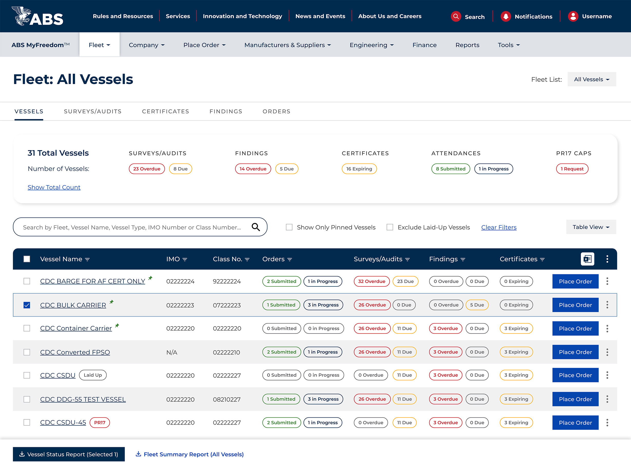
The ABS MyFreedom Portal is a suite of fleet management and vessel compliance services used by shipowners, vessel managers, engineers, and more. It allows users to place orders for surveys and audits, download reports, view findings, manage finance, as well as view key performance indicators (KPIs).
Research Process
Interviews, Audits, Stakeholders
Our design team started the project asking important questions about users. Who are users? What do users need to know and do? How does the portal satisfy these needs? To answer these questions, we:
- Hosted working sessions with ABS stakeholders
- Performed an audit of the current experience
- Analyzed 150+ customer surveys
- Conducted 10+ user interviews
Personas & Wireframes
The UX Phase
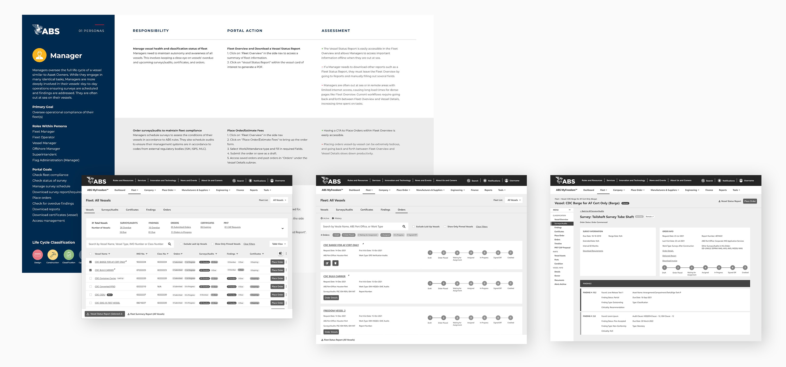
One redesign requirement was to introduce a tailored experience to profiles of users. This meant creating personas describing goals, responsibilities, portal actions, roles within the persona, and an assessment on how to implement this in design. The following phase would consist of wireframes informed by our research, with rounds of revisions and varying levels of fidelity.
A System for Data
Accessibility and Components
Color
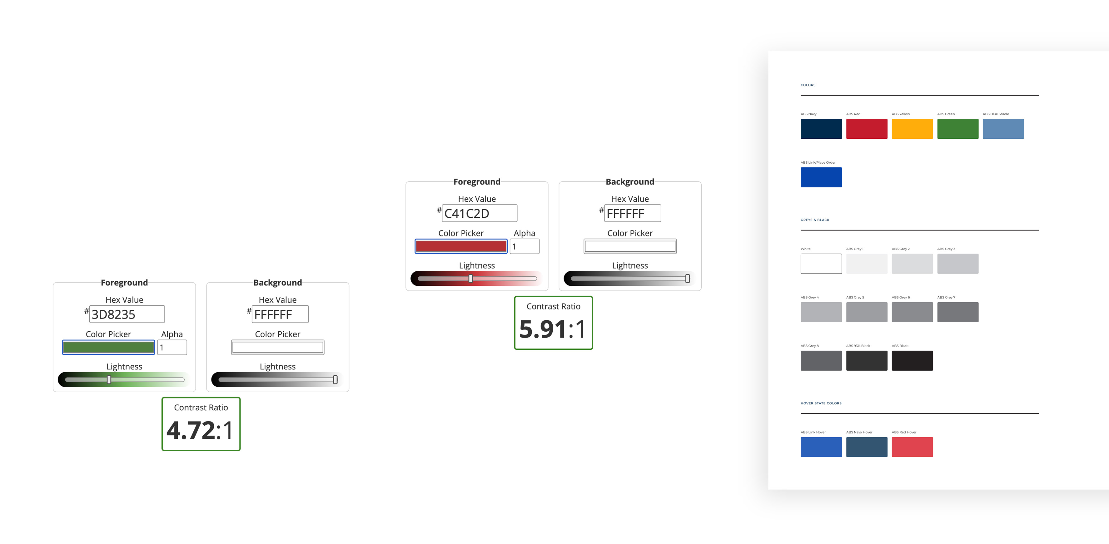
ABS provided our team with a brand color palette but some colors failed web content accessibility guidelines (WCAG). We adjusted these values to pass accessibility, a critical measure for users consuming large amounts of information and data.
Typography
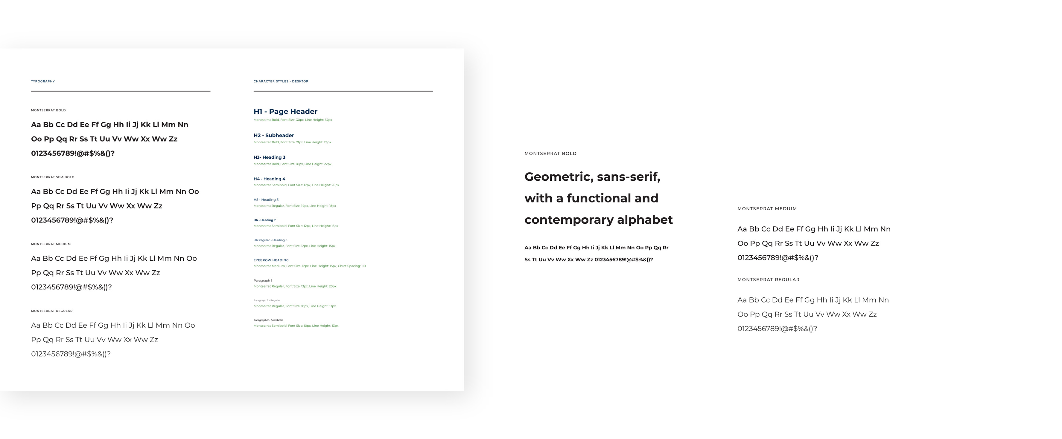
Our choice of typeface had to be easily legible, both alphabetically and numerically given the portal’s content. Montserrat’s geometric, functional, and sans-serif letterform fit this requirement well.
The rest of the system
The remaining system documented calls to action, KPI’s and tokens, navigation, dropdowns, forms and fields, iconography, accordions, and other components.

The Key Screens
UI Design
With over 150 wireframes and 90 high-fidelity screens designed, largely due to the complexity of the portal and the states required, here are some of the key screens delivered:
Dashboard
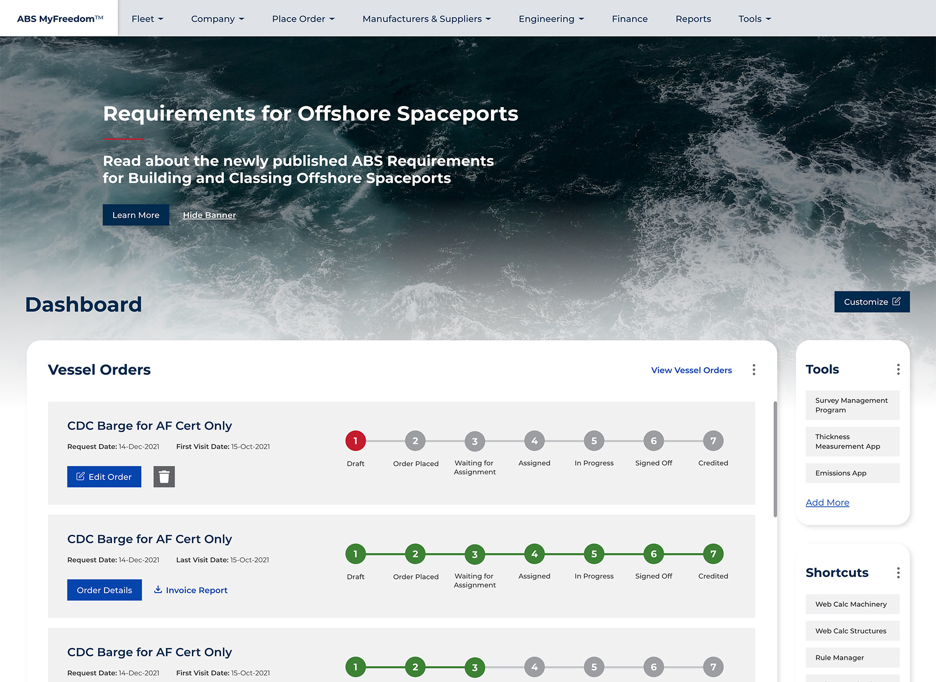
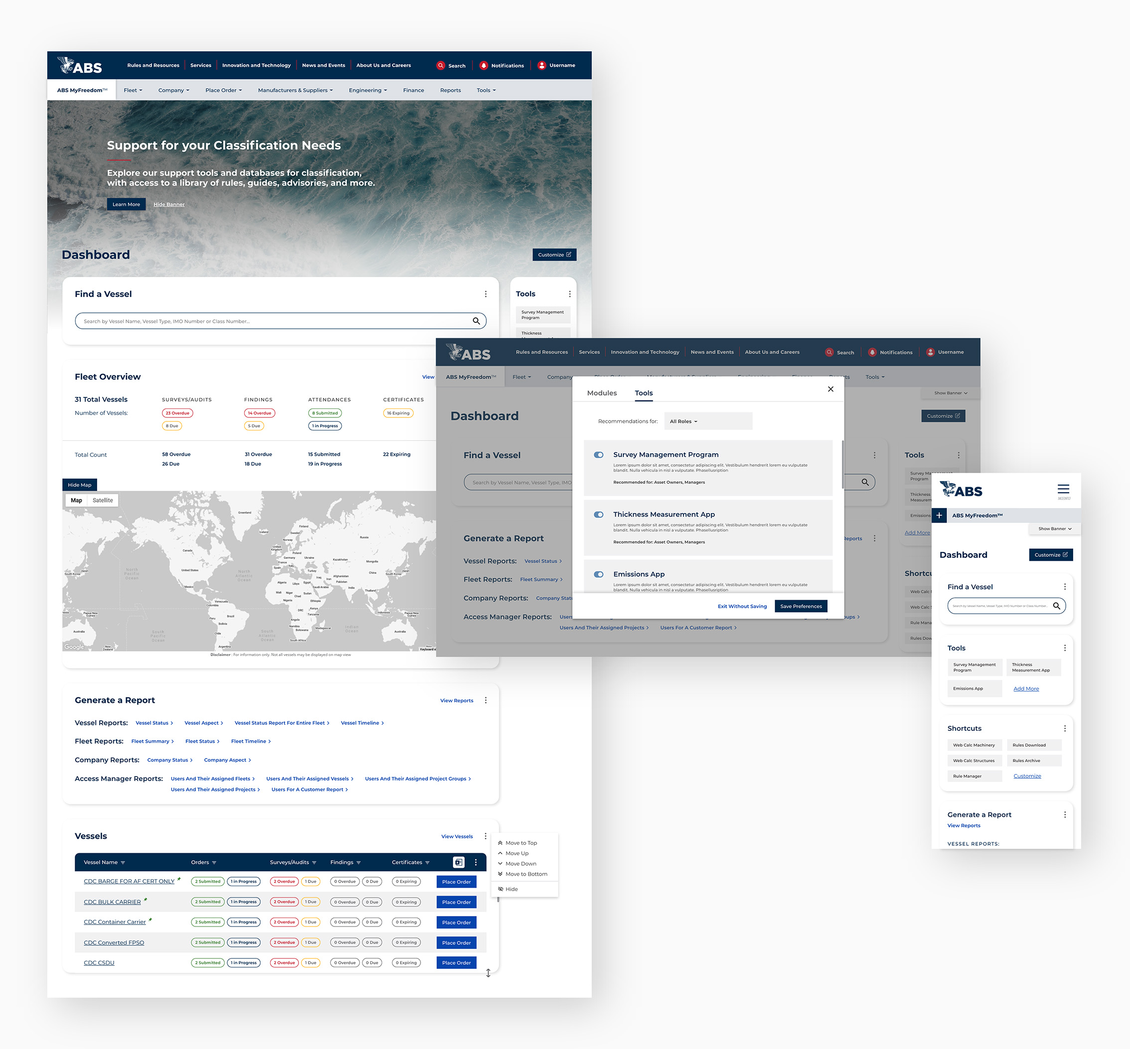
Consisted of modules with the most important functions for users based on personas from the research phase. Users could also customize their dashboard by rearranging, resizing, adding, and removing modules and tools.
Vessel overview
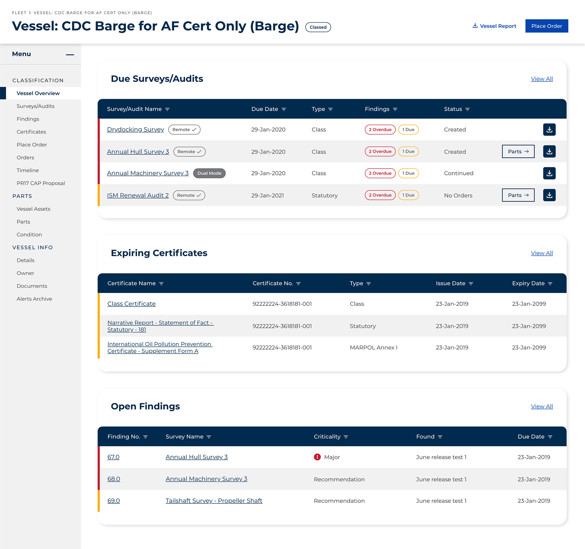
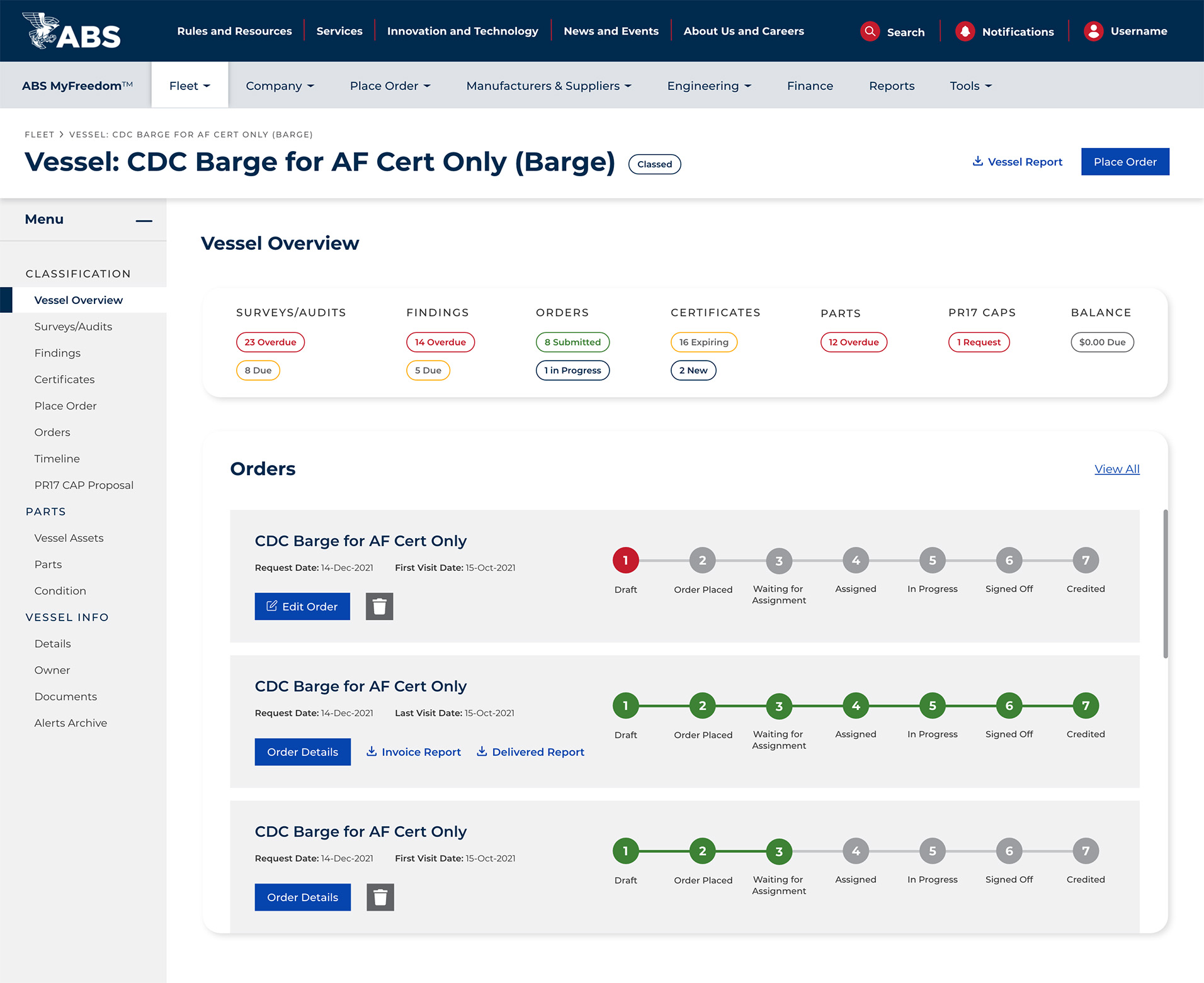
Provided a detailed view of individual vessels, including key performance indicators, a sub-navigation, the ability to view orders, surveys and audits, parts, alerts, and more.
Fleet overview
A comprehensive view of an entire fleet, allowing users to download multiple reports, pin important vessels to the top, search, filter, switch to card or timeline views, and see performance metrics for all vessels.

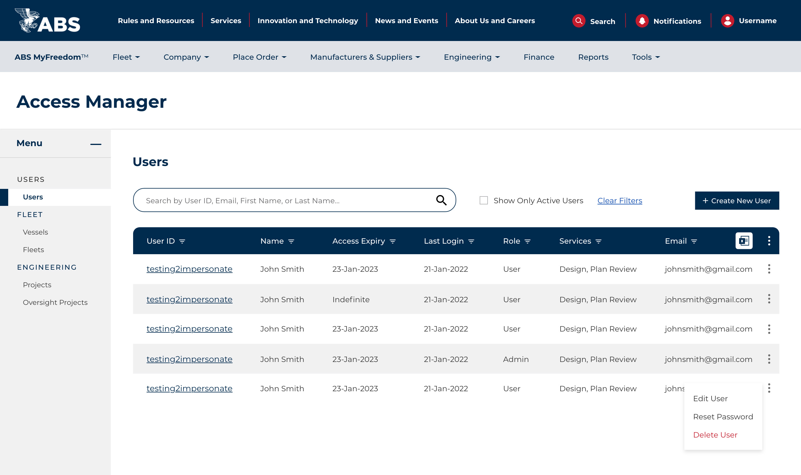
Access manager
The place for admins to manage users by creating, editing, or deleting profiles. Admins can also view user IDs, names, access expiry, last login, role, services, and email, with options to filter and search these items.
A New Contract
Project Success
After we delivered final designs to the development team, ABS stakeholders were so pleased with our team and work that we successfully landed a new contract for an engineering manager application.