Logo.CCI.Stacked.White-Web
Freedom Calls
Big Coverage, Small Costs
Research
UX Design
UI Design
Branding
Consumer Cellular is a wireless network that offers nationwide 5G+ coverage, cellphones, no-contract plans, and accessories with a focus on users over the age of 50. Our team consisted of researchers, designers, solution architects, developers, quality assurance specialists, and project managers.

A New Shopping Experience

Project Summary

Our mission was to redesign the shopping experience for the Consumer Cellular website with the goal of improving conversion rates and transaction flows. We would leverage Adobe Experience Manager (AEM) with existing commerce backend APIs. This complex task included purchasing plans, cell phones, accessories, as well as activating retail phones, bringing user’s existing devices, cart flows, and checkout.

The Beginning

Research & Analysis

Using multiple data sources, we uncovered insights and validated themes that would inform our design phase of the user experience. This included:

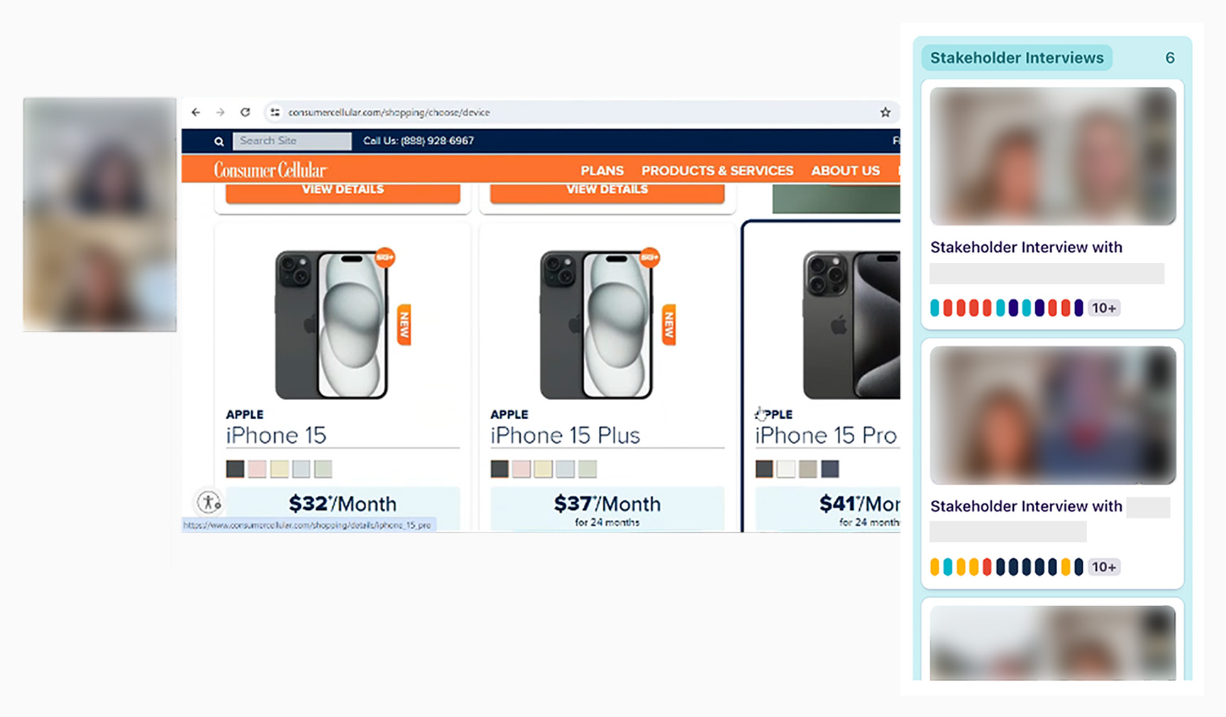
Primary Research: Stakeholder Interviews, User Interviews

Secondary Research: Competitor Analysis, UX Audit, Best Practice Guidelines

Documentation: Existing Analytics, Shopping Flow, How Might We Statements

6

Stakeholder Interviews

10

User Interviews

6

Competitors Analyzed

20+

Best Practices Identified

25

Documents & Videos

100

Cups of Coffee

Interview Findings

Six Themes

Primary research was combined into six themes that enabled improvement in the shopping experience:
1.)  Brand differentiators are not recognized
2.)  Unlimited data is important, for different reasons
3.)  Initial feel is simple and transparent
4.)  Cognitive load increases over time
5.)  Mobile site is more difficult to use
6.)  A need to elevate the user flow
Faces and names are blurred for privacy purposes.

The UX Audit

Identifying Problem Areas

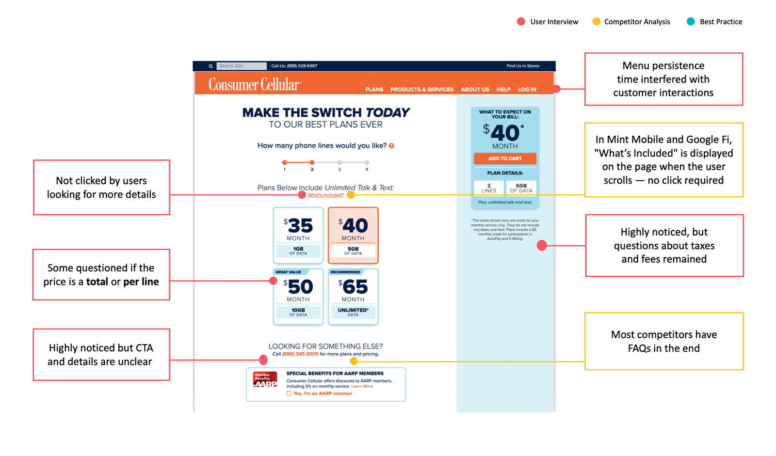
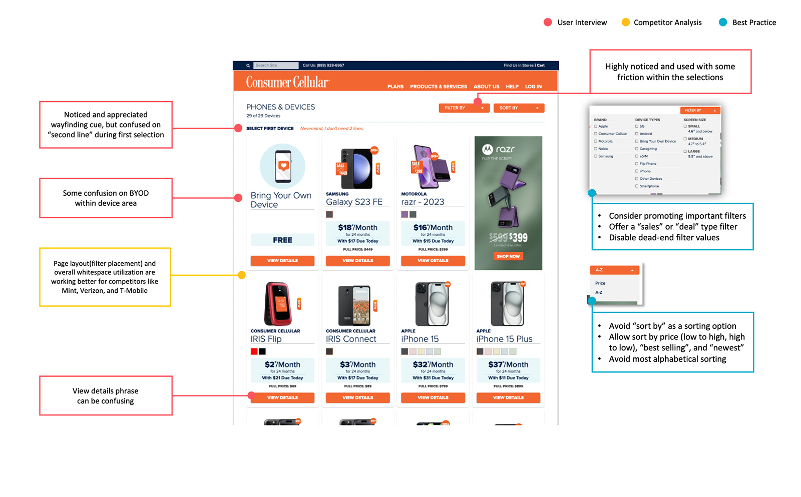
Taking inventory of the critical shopping flow screens, our team conducted a UX audit informed by our previous research, competitor analysis, and best practices and design principles. Key screens included plan landing, product list, product detail, bring your own device, cart, and checkout. An audit of the mobile experience was performed as well.
Our team also considered how well these screens work within their respective flow (purchasing a plan, checkout, etc.). A problem area within device configuration, for example, was that users had to choose to replace an existing device or add a line. This was in addition to selecting their device specs, such as color, storage, and condition.

Plan Landing

Product List

Looking At The Big Brands

Competitor Analysis
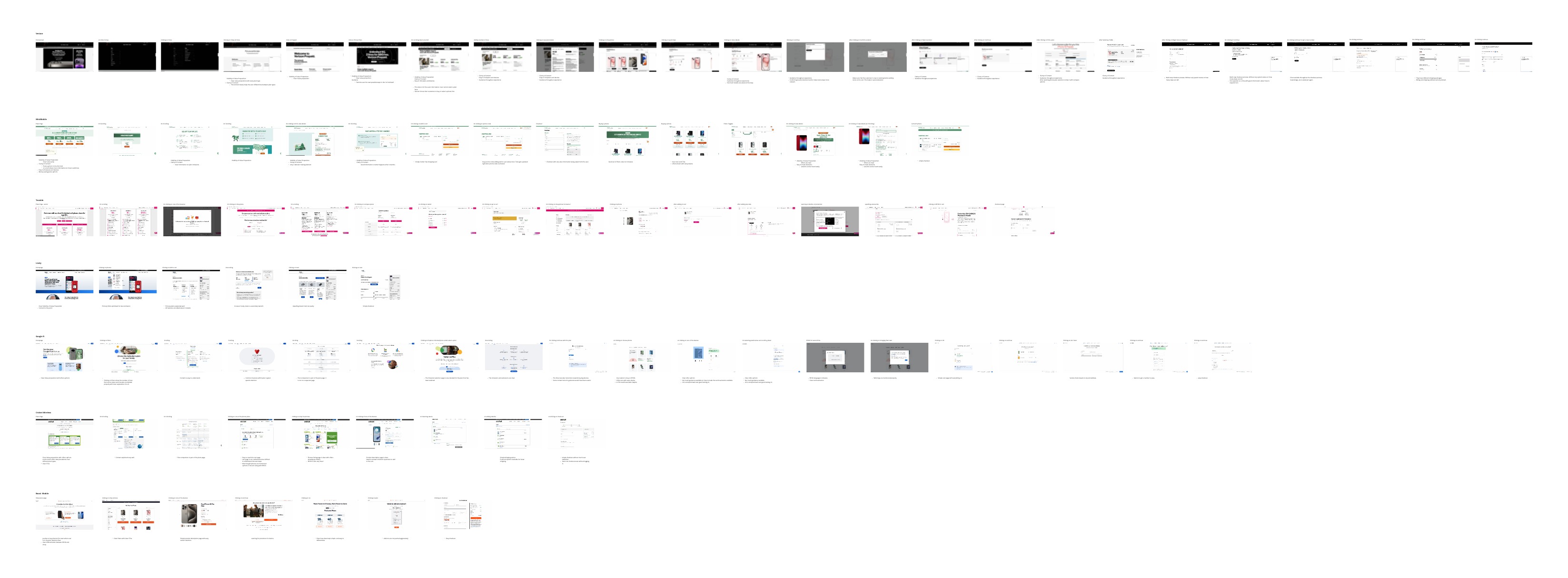
The large space of competitors in the industry allowed us to document and analyze a variety of shopping experiences. Verizon, Mint Mobile, T-Mobile, and Google Fi were notable brands we looked at. We also reviewed smaller carriers such as Boost, Cricket, and Lively.
Important features of these experiences included: how brands handled value propositions, plan card hierarchy (data vs. cost), plan comparison, validating existing devices by IMEI or make and model, adding to cart and cart validation, tracking user progress, porting-in existing numbers, billing, and new vs. existing customers.

Meeting in Phoenix

Connecting with the Team

As part of the project, our team flew out to Phoenix, AZ to meet with the Consumer Cellular team at their headquarters. It provided us the opportunity to connect with our client and colleagues face to face. We also formally presented our research, UX audit, visual stylescape, and accessibility recommendations. Additionally, we conducted a whiteboard exercise to align on a primary shopping flow for the experience.

Onsite Design Session

Whiteboarding User Flows

The Primary Flow
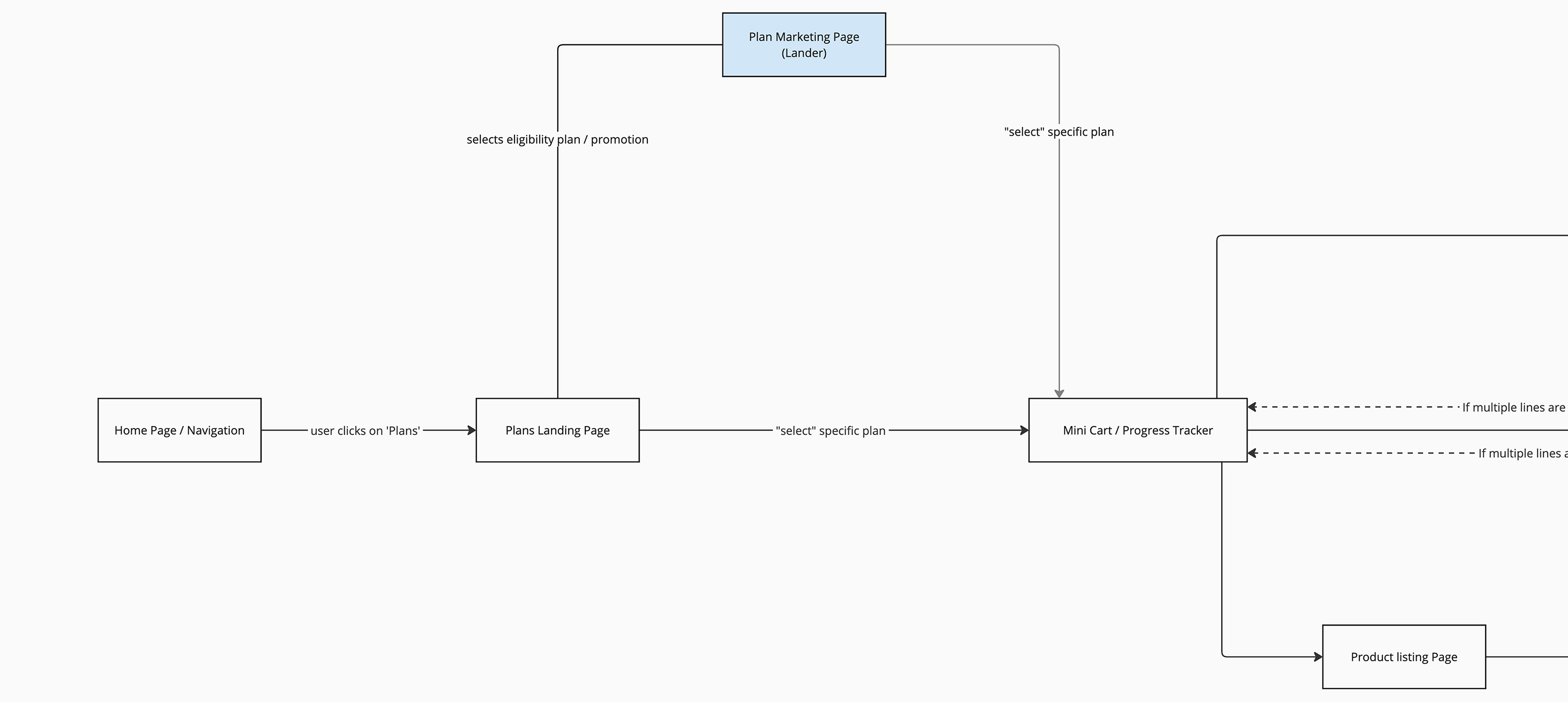
The primary flow is the main path users take to complete a transaction, as well as the path that prioritized Consumer Cellular’s business goals — increasing plan subscriptions. This meant navigating to plan landing as the first step. After line and plan selection, users are taken to the Mini Cart which served as the progress tracker for their order. A plan details page was avoided to simplify the experience and prevent users from navigating back and forth.

Mini Cart and Device Selection

The Mini Cart is a key step allowing users to modify their selected plan, choose per line to bring your own device or buy a new device, edit device configuration, view a cost summary, apply discounts, and cross sell accessories and devices. To progress in the flow, users are required per line to either bring their own device (BYOD page) or buy a device (product listing page).

Cart and Checkout

Once a user has either verified an existing device or selected and configured a device on the product details page, they advance to the cart to review their order before placing it. The cart also provides a detailed cost summary, error states if necessary, and an ability to go back and edit previous points in the flow. Finally, a user moves onto checkout where everything from shipping information to payment occurs.

Designing for Older Adults

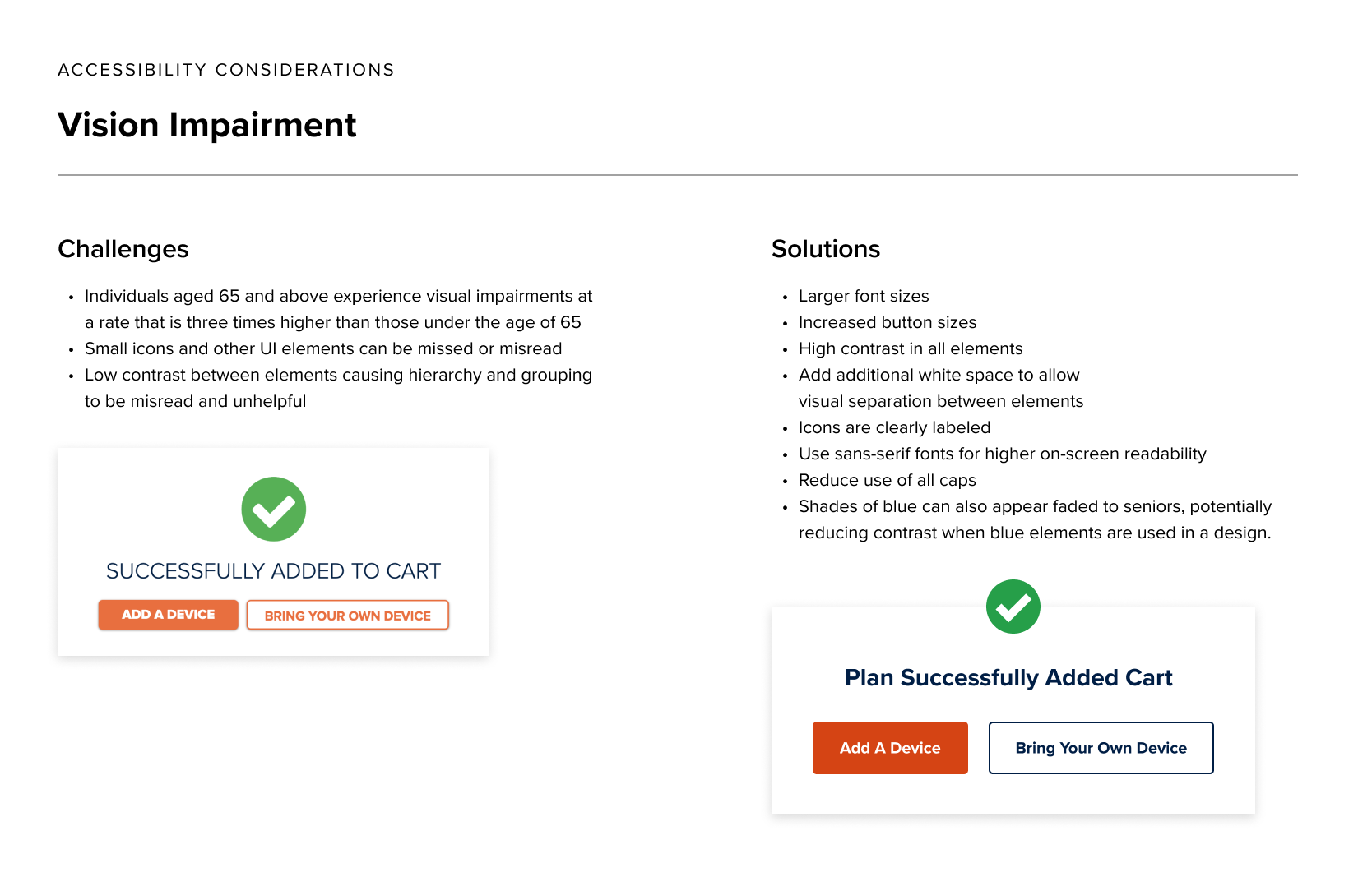
Accessibility Considerations

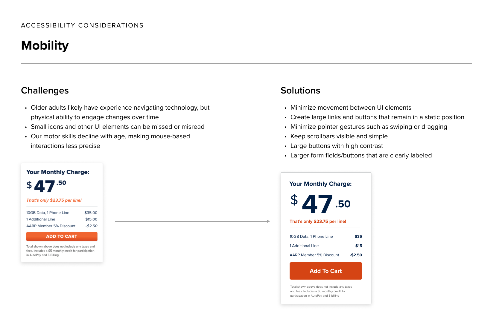
Moving into visual design, we created documentation for accessibility considerations focused on older adults. This included vision impairment, mobility, and cognitive load. Examples of these were:

  • Larger type and clear hierarchy
  • Increased UI element size (buttons, icons, etc.)
  • WCAG accessible color contrast
  • Grouping of associated actions and content
  • Helpful labels and tooltips

Visual Design and Prototypes

Design Come to Life

Extensive wireframes refined our user flows and set the ground for visual design. Additionally, animated Figma prototypes allowed our team and client to see flows and interactive components in real time.

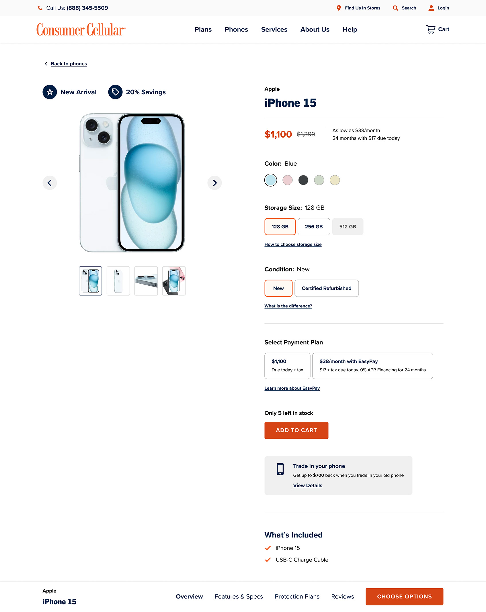
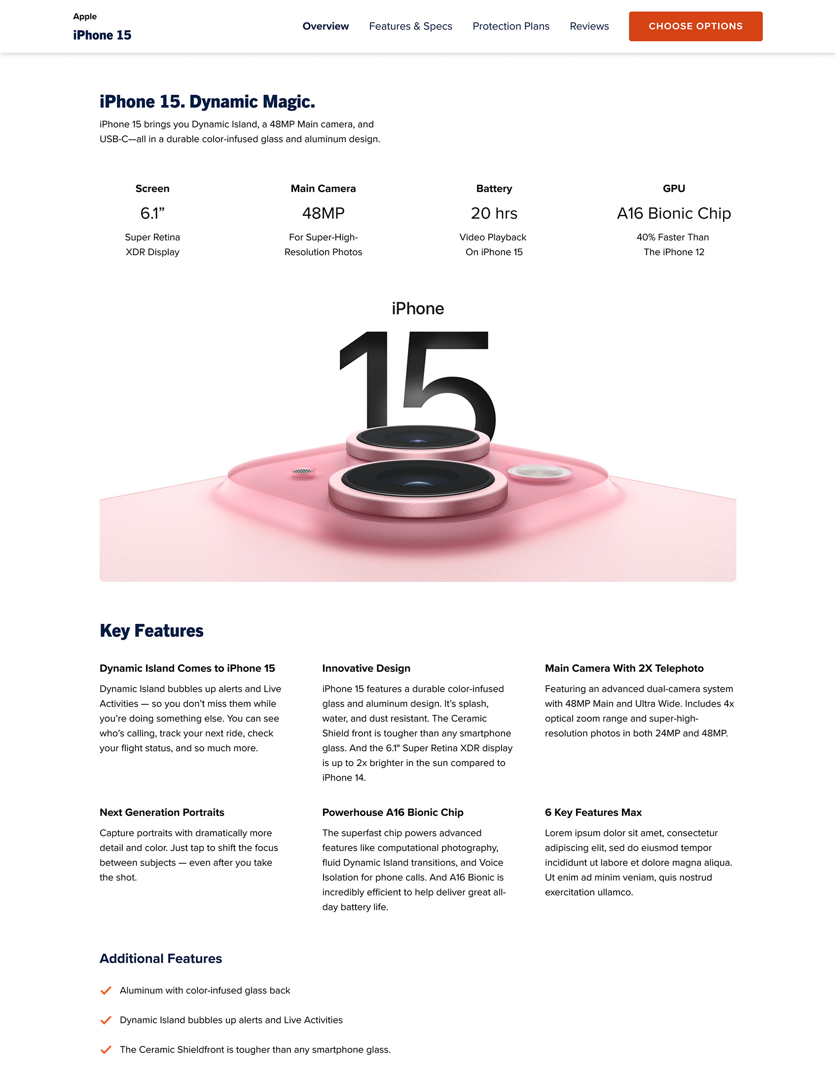
Product Detail

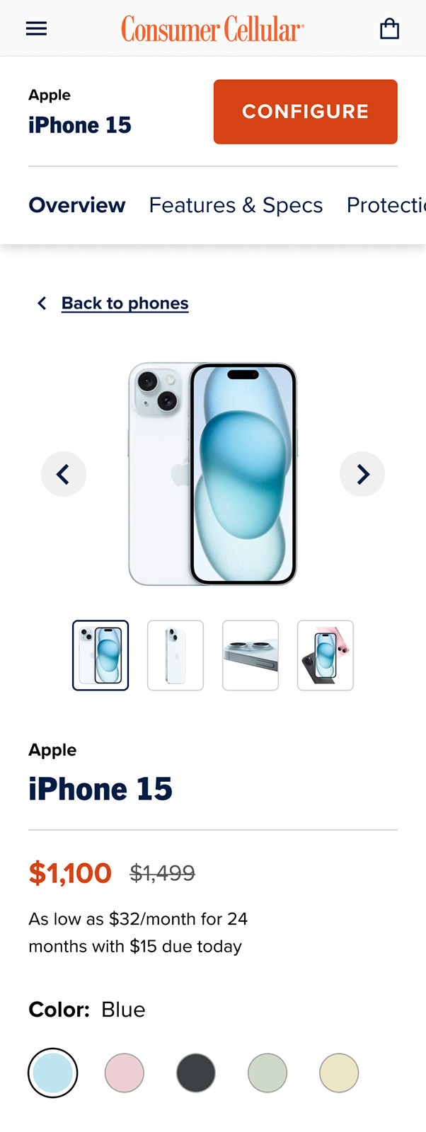
Where users can view product imagery, tags, price, and configure their device. Content below the fold includes features and specs, protection plans, and reviews. A drawer triggered on add to cart separates several flow requirements from the page itself: sign in, number selection, protection plans, and accessories.

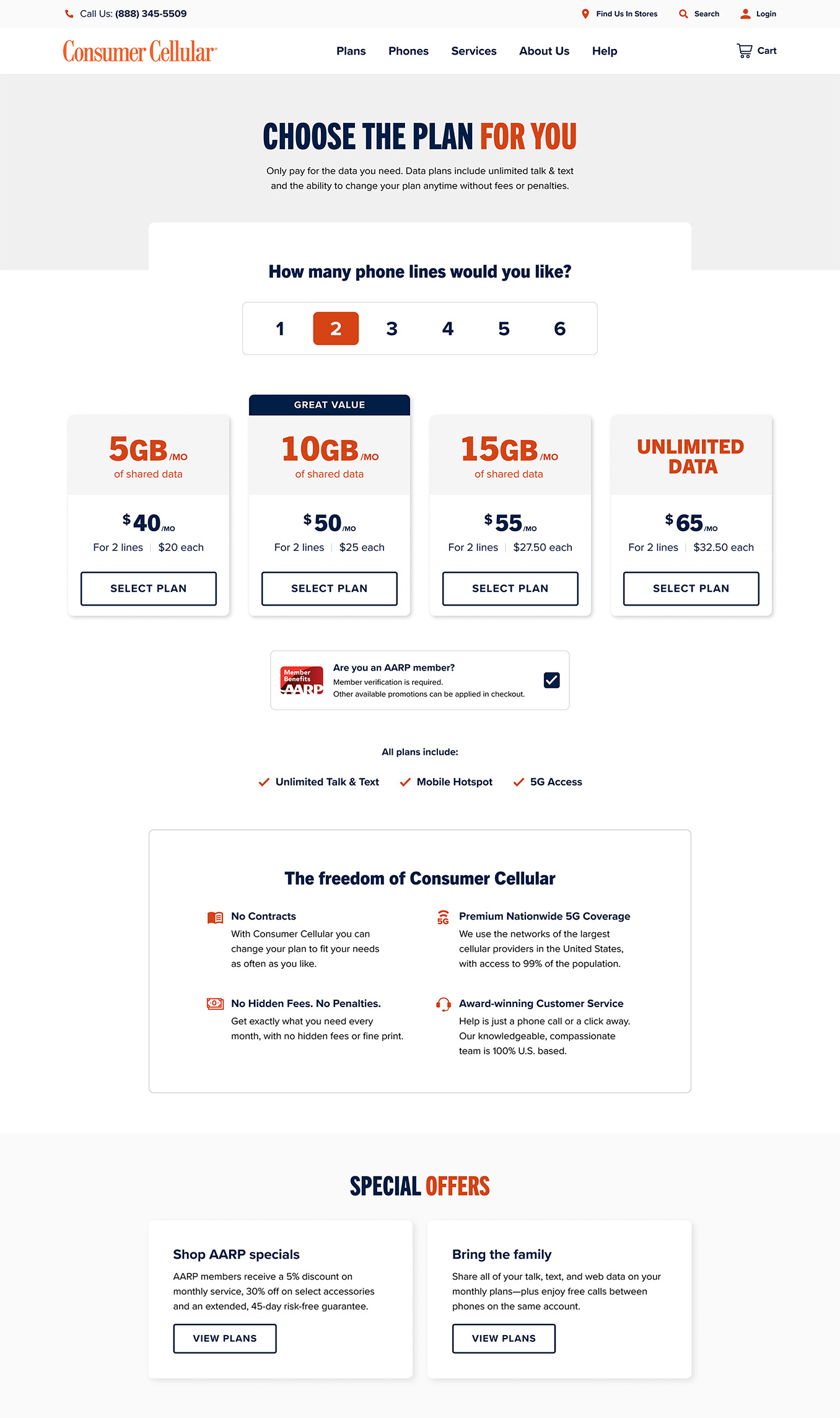
Plan Landing

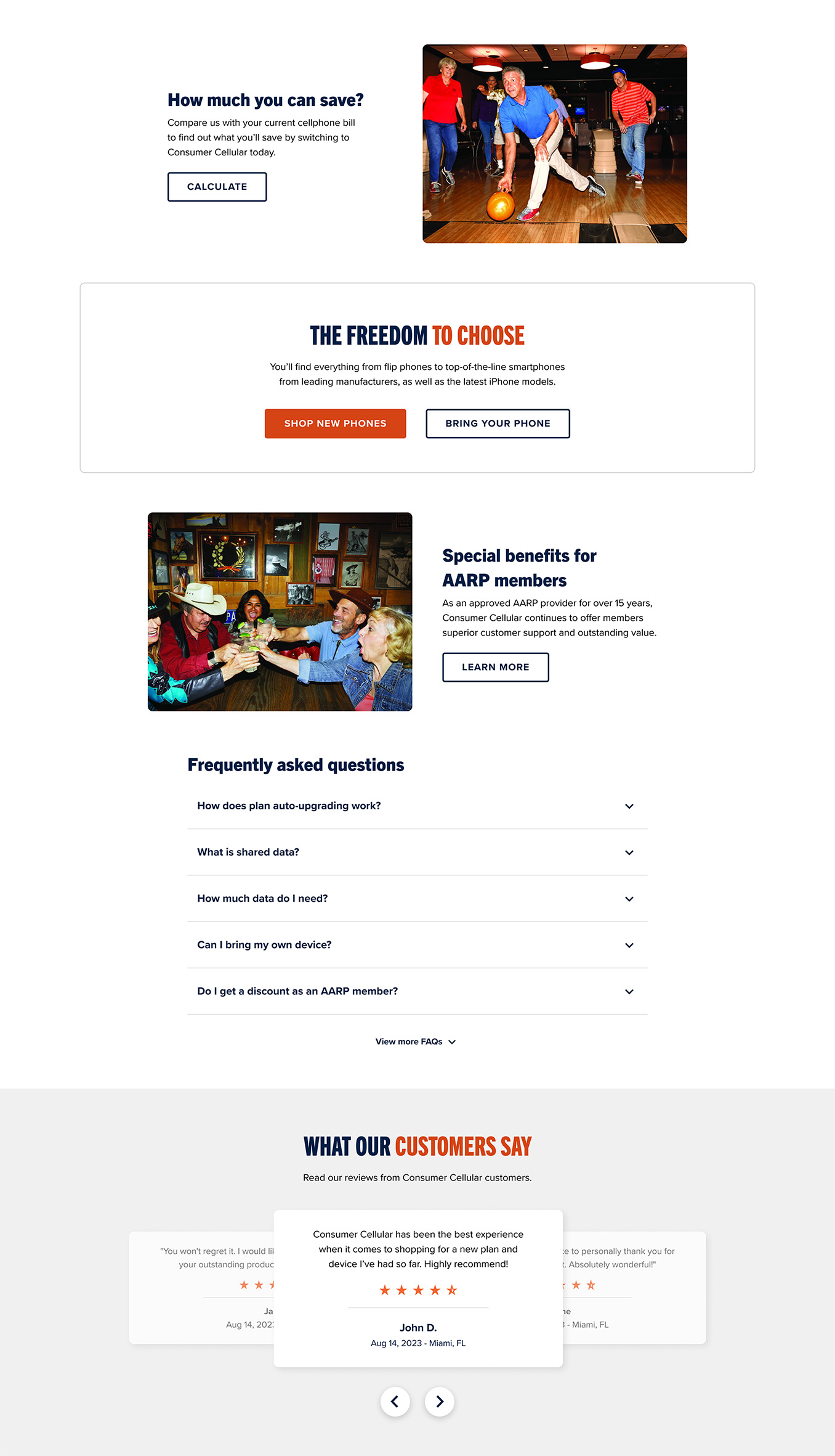
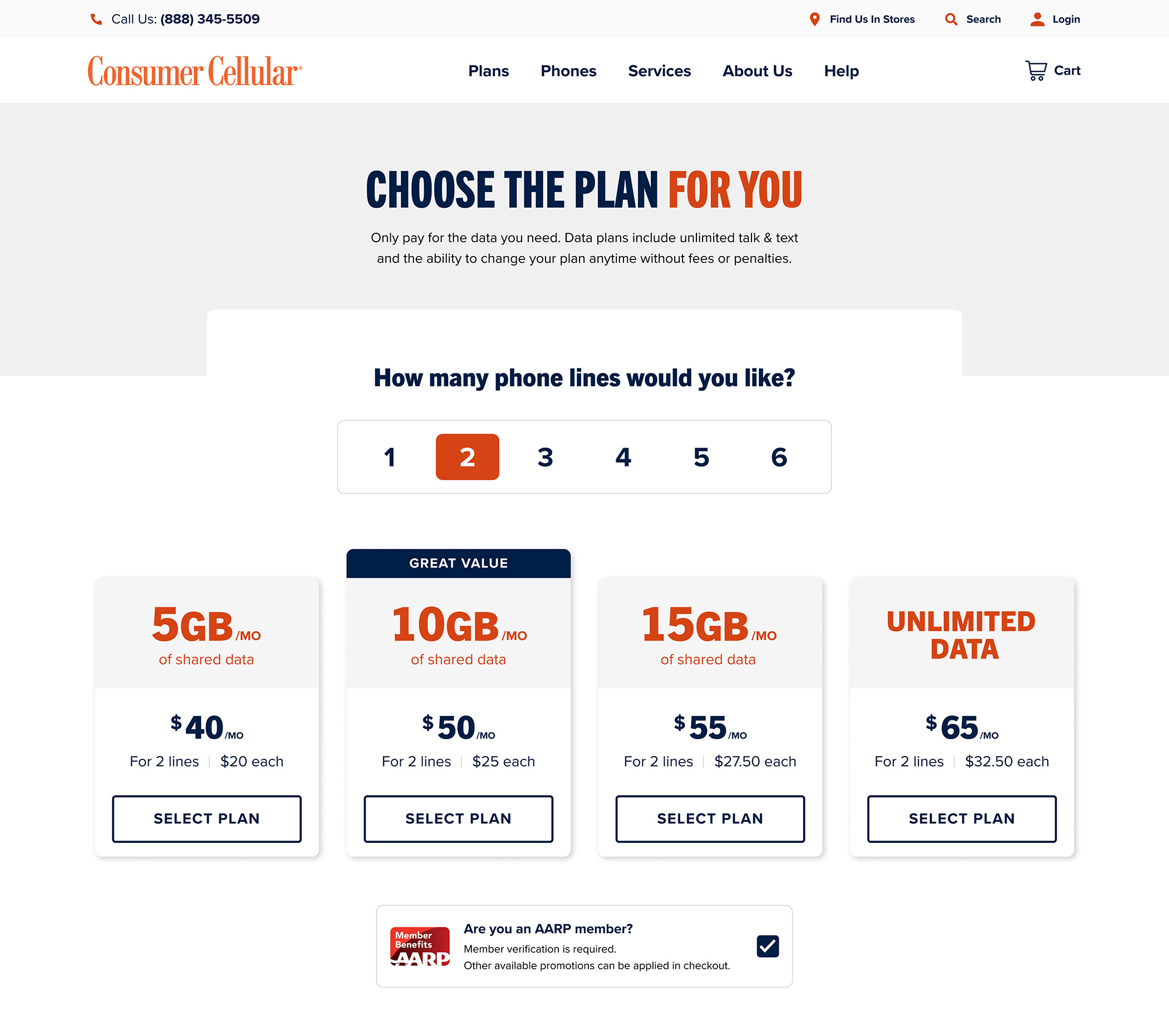
Consists of a corresponding lines toggle and plan cards, meaning user’s can see pricing based on number of lines selected. Plan cards prioritize data over price, a significant change from the previous design, as well as per line pricing and value tags. An AARP member discount is pre-checked with member verification occurring later. Supporting content includes plan features, brand value propositions, special offers, savings calculator, AARP benefits, FAQs, and customer reviews.

Product Listing

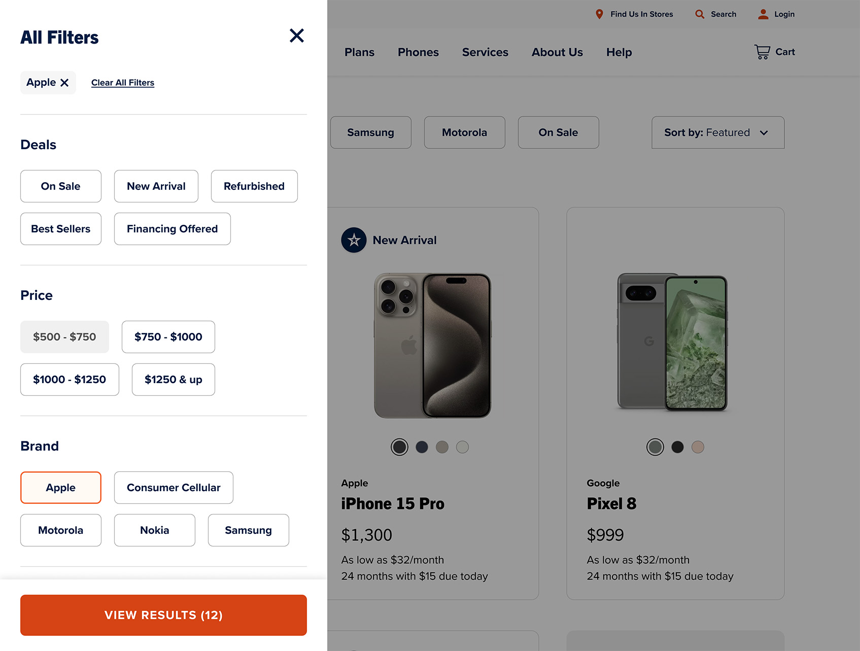
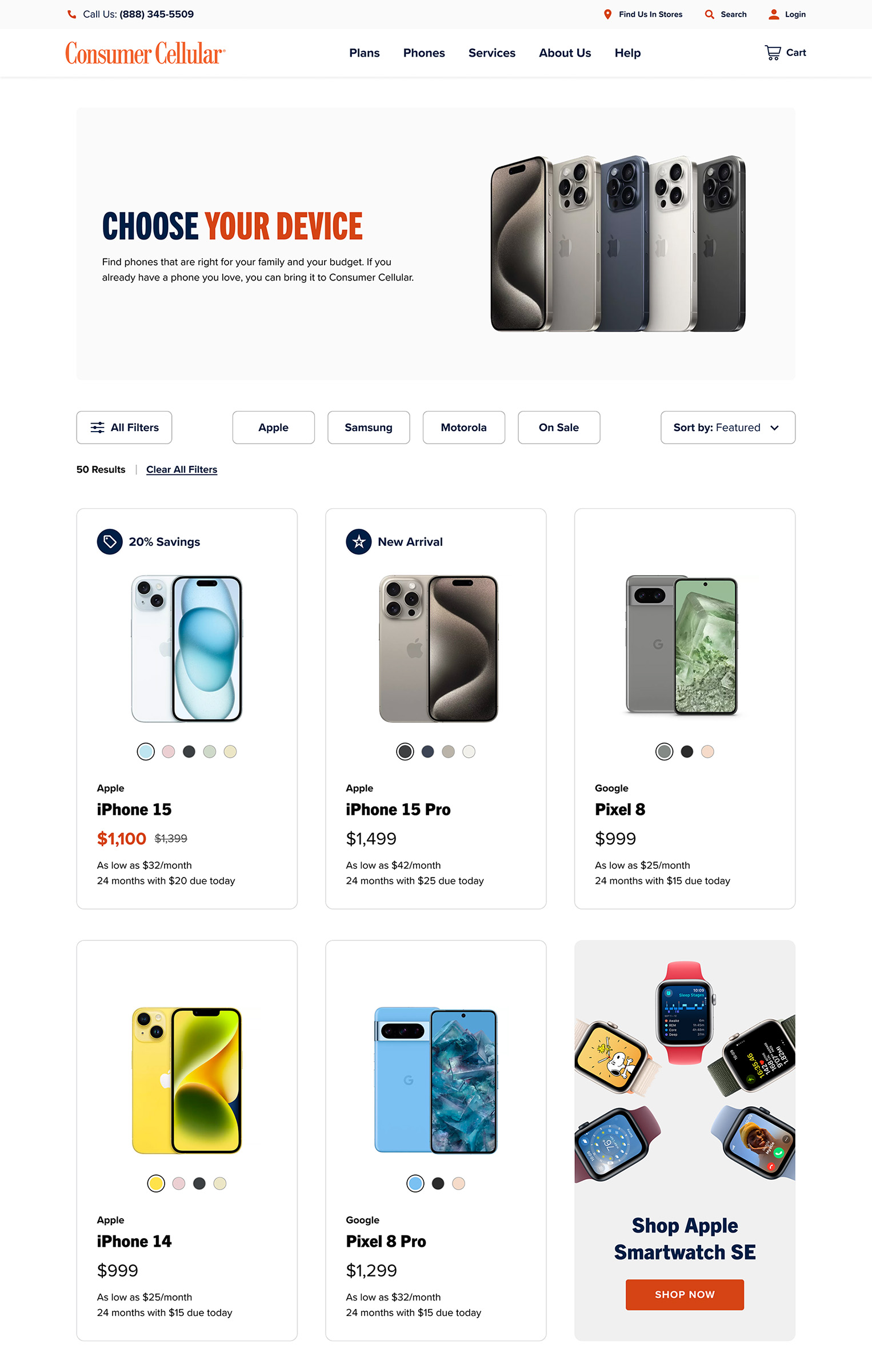
The listing of phones and devices with ability to filter by deals, price, and brand. Popular filters are easily toggled directly on the page, and sorting by featured, best sellers, and price is supported. Cards themselves include product tags for savings, new arrivals, stock, and condition. Strikethrough pricing is also present on discounted devices.

Mini Cart and Cart

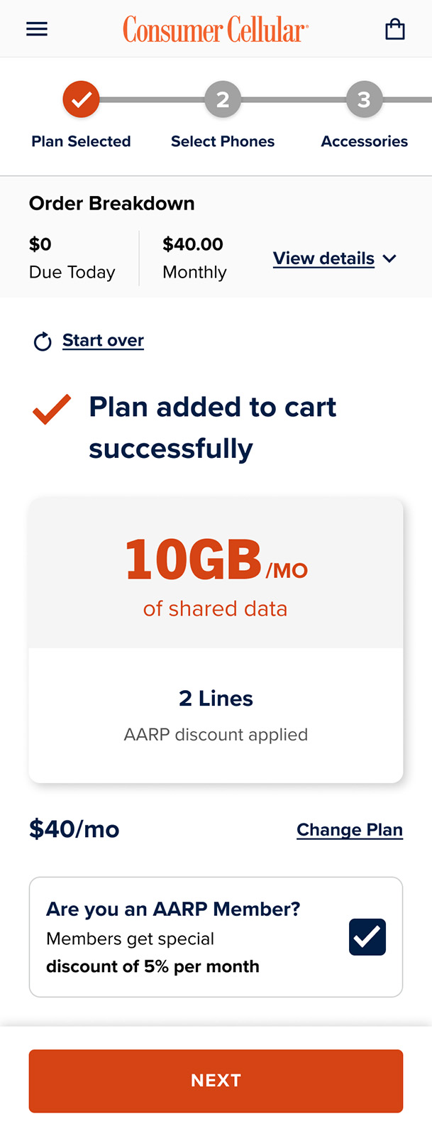
The mini cart is a stepped flow that tracks plan selection, phone selection, and accessories. The cart is the final review step before a user proceeds to checkout. This guided experience helps users satisfy the requirements to complete a full plan and device transaction. User’s are able to edit their plan and device, view their order breakdown by due today and due monthly, save their order, and navigate to any previous step.

Mobile Designs

Responsive Considerations
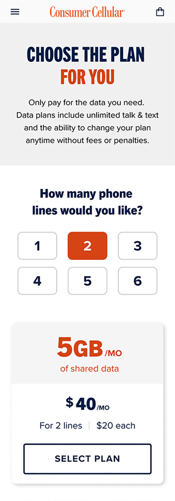
Adapting components and pages to ensure a consistent experience across devices was critical. Components such as the lines toggle required a different layout and default state. Page elements like the order breakdown had to be collapsed in an accordion.

Project Outcome

An Improved Experience

Build is still in progress so it is difficult to measure the outcome of our efforts. Quantitative data on conversion and drop-off rates would be great to have, as well as time for A/B testing and additional UX best practices. However, our research and design expertise has certainly improved upon the existing experience, an achievement worth recognizing.